Often, PhD students imagine their journey to be linear and then it ends up with pitfalls and successes:
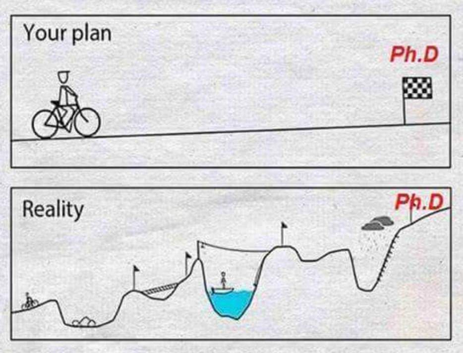
This post is about when you get into the dips, or as I call them, pits of despair. Sometimes when you are in a lull you don’t know how you got there, or how to get out. This can be spurred by external issues (see How I avoided a PhD meltdown) or issues directly related to your project.
I have found when I am in the pits related to my PhD visualising helps. This only really works when it is an issue related to my PhD. Some issues I have had are:
- being overwhelmed by the data, where do I start?
- a document I am editing isn’t working, but I can’t figure out why
- my brain feels like mush and nothing seems to be clicking
- I feel like an imposter who knows nothing
This post explains some tools for visualising that may help you see clearly. I am a visual person, so for me I believe this really helps me to understand where I should go next. If you are overwhelmed by external things, I am not sure that visualising will work.
I will briefly explain mind maps/diagrams, visual editing, drawing and visual data coding.
Mind maps/Diagrams
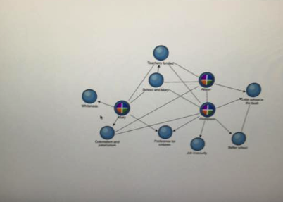
I have used mind-maps and diagrams at every stage of my PhD. They allow me to think in a way that is not linear and see how ideas interconnect. Some examples:
Above I have two examples of the way that I visualised the connections between my data. I have blocked out some of the ones in the mindmap above, but you can see that I have 4 main ideas which I have coloured coded and tried to see connections between all of them. When I made this diagram I was very confused by my data and how to represent the complexities of what I found. I am still unsure, but this helped me to see the main ideas that were connected and the ideas that I thought were the most important.
Nvivo also has a really cool tool where you can link your Nvivo codes to the mindmap:
Unfortunately, I do not have many more examples, as often my mind-maps are on paper and after my computer died last year I lost all of my old photographs which contained most of my mindmaps.
Visual editing
At times I recognise that my writing is disjointed but I can’t see how. At times like this, sometimes a critical friend or your supervisors can assist; however, I think that figuring it out yourself might increase your own writing skills and editing abilities. I have three tricks I use for visual editing: cutting the document up, highlighting and post-it notes.
1. Cut the document up
This is a great tool for looking at your own writing in a different way and identifying how paragraphs/sentences might work in a different order:
- I print my document (one-sided) and cut out all paragraphs (you can also do this at the sentence level). Put all introductory paragraphs to the side, particularly ones that explain the structure of the writing.
- I mix them up remaining sentences and walk away (make a cup of tea or have lunch)
- Re-arrange the sentences/paragraphs in an order that you think makes sense, trying to forget how you had it structured previously.
- Open a new document and copy all the paragraphs in the new order. Keep your old document just in case.
- Assess if you need to change linking sentences, topic sentences and change if required
- Read the whole document and decide if you like the new structure better (maybe also assess what changed – just as a learning tool for yourself)
2. Use highlighters/the highlight function
I use this strategy when I feel that a paragraph is clunky. When I say clunky, sometimes this means that there are two paragraphs which appear to be organised well but are actually a mismatch of two different topics. For this, I use the highlight function in Microsoft Word. I identify the topics that I think the paragraphs have and use a coloured highlighter for each. For example in this picture, I have yellow for ‘othering’ practises, pink for the commodification of culture and green for claims to authenticity:
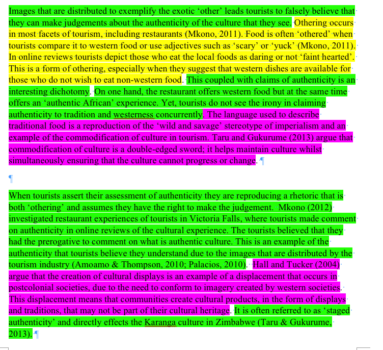
It immediately became clear to me when I did this that the first paragraph was a jumble of topics. This was for my confirmation document last year and I had received feedback from my supervisors that this section did not read well. This helped me to understand why. Please also note, that this is a very early draft of this document, so please use it for understanding the technique, not the content.
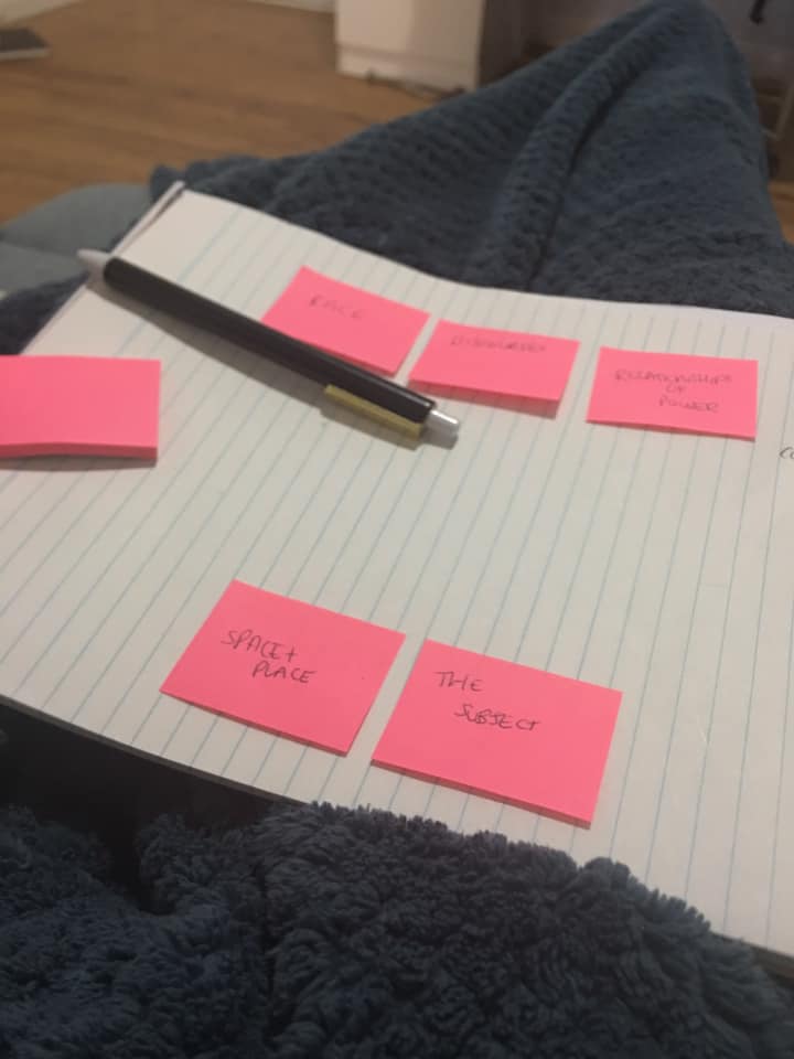
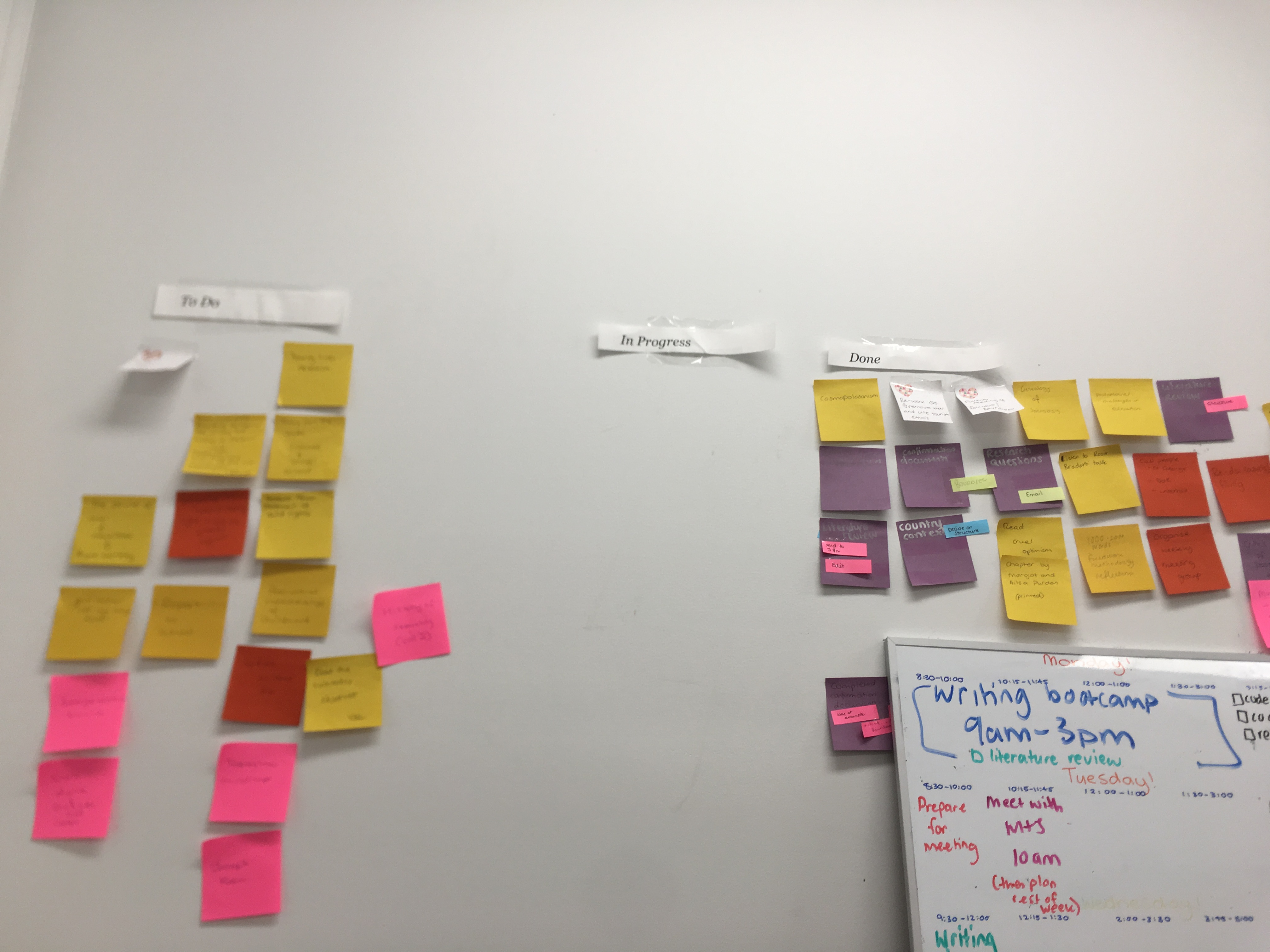
3. Use post-it notes for structural editing
This tool I use for larger chunks of text which have multiple paragraphs and are too large to organise in the ‘cutting up’ method. Its very simple, I identify all of my section headings and write them on a post-it note. I re-arrange the post-it notes into themes or in an order that I believe works. This takes time and I play around with it until I feel the order is right.
Drawing
This is a technique that I wish I was skilled in. My lovely friend Kieran has kindly offered to provide me with an example of the way he uses drawing in his PhD.
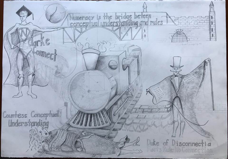
Kieran accompanied this image with a short description of how it helps him:
“Drawings and the archetypes and metaphors really help me personify the major actors or agents in the ontology of my study. With this big drawing in my mind, I can elucidate more freely without reading from notes. It is being added to all the time of course as I find new actors, agents and metaphors in the landscape of my ontology.”
I have added it into my plan for the next few months, to try and visualise my PhD and some of the interconnections between concepts. Definitely cool and a great technique to understand connections between things!
Visual data coding
For somebody who is a big Nvivo fan (for example Nvivo for a literature review: How and why and My adventures in transcription!) I actually did not use Nvivo much for my data analysis. This is because Nvivo for me is a data storage system, it does not analyse my data for me.
Here, I will briefly describe some of my initial steps of data organisation and coding:
- Read all of my transcripts without writing anything or coding
- Wrote some notes down (see image above under mind maps) and tried to see connections
- Used Post-it notes to move codes under larger themes (note at this stage I had not coded any of my transcripts – this was initial thoughts from just reading my data). As you can see here I used larger post-it notes to identify the broader themes and then smaller ones to identify sub-themes:
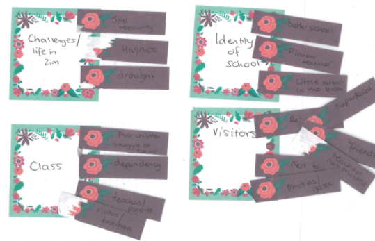 The four here are an example, but I actually had many more (too many). I scanned these post-it notes into Nvivo so I would have a copy of them for the future.
- I coded the transcripts in Nvivo to these codes and themes I had worked out. I then printed these and cut out each quote and visualised them on large pieces of paper. This meant I could move quotes around and change the codes slightly where I saw fit. It is hard to photograph but looked something like this:
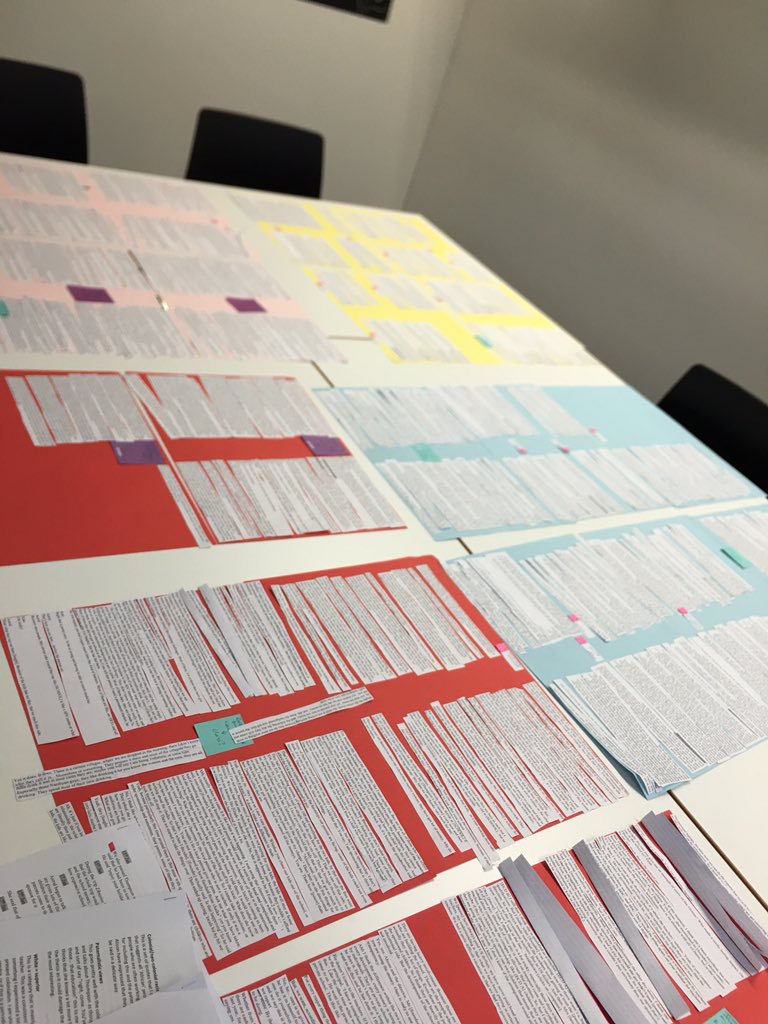 These pieces of paper are colour coded to broader themes and these colours match the mindmap in the first section of this post. As you can see this data was A LOT of data. This is where I got overwhelmed. What you can see here is about 1/3 of the data I showed my supervisors. Following this meeting, I did the mindmaps, which you can see in the beginning of this post.
- The step is happening now, I am writing and connecting more of my theory to data (very exciting) – maybe I’ll have a post on that soon!
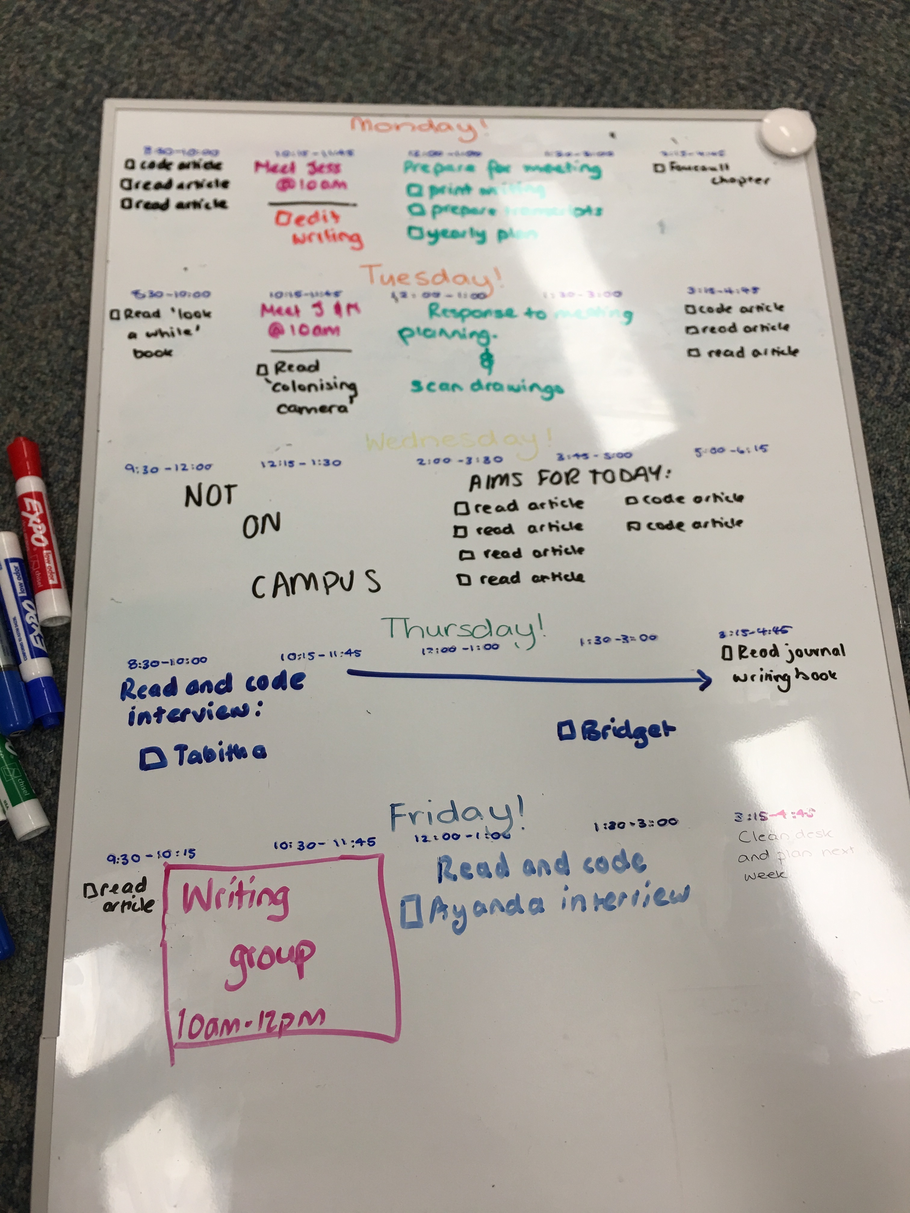
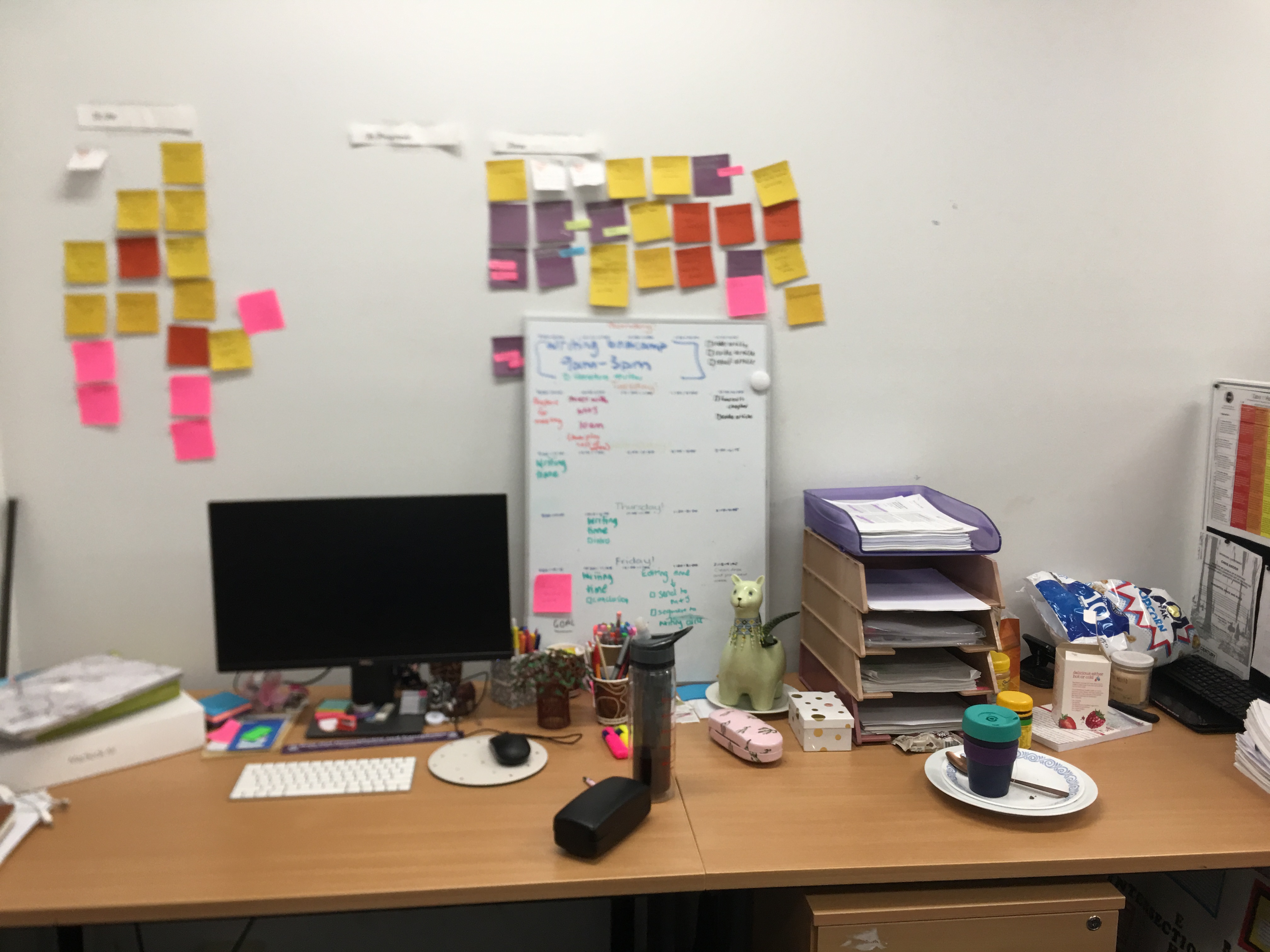
I hope this post has helped you. There are many other ways I used visual methods in my work, but these seem the most translatable. For organisation using visual tools please see my post on How I plan in my PhD/Organise my desk.
Please share your thoughts, tips and tricks in the comment section!


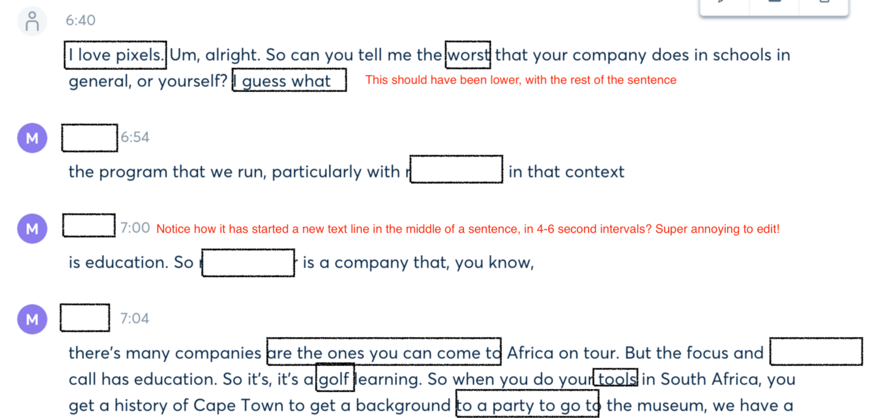
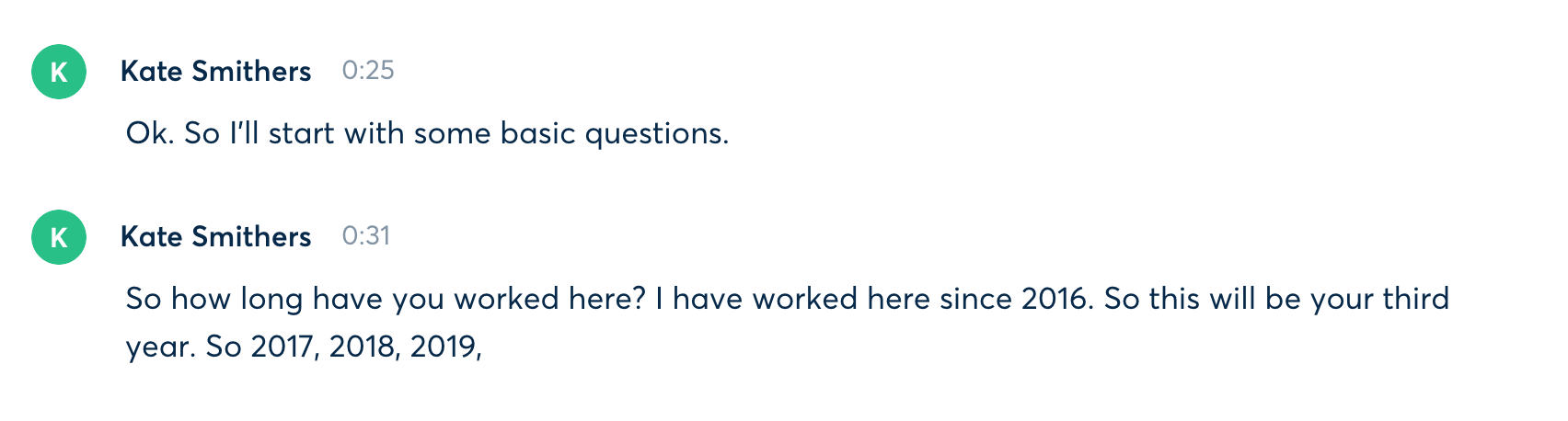 Whilst it cut down on typing, I had a severe amount of editing to do AND the timestamps didn’t align with the interview audio, as when I was speaking out loud I was actually a lot quicker than the interview had been. I think the first 1 hour interview took around 10-12 in total, due to the need to listen and re-listen and correct the words that Otter had heard wrong (quite a lot of words actually – turns out it really doesn’t like my voice, or African place names). Not to mention questions didn’t have question marks, some sentences were cut off etc.